Onward
A calm, sleek job-application tracker that turns a chaotic, demoralizing search into something you can actually see and steer.
The 30-second version
I applied to dozens of roles and lost track of nearly all of them. Onward is my answer: one place to log every application, see exactly where each one stands, and never let a follow-up slip — wrapped in a dark, focused interface that respects how stressful the search already is.
Glanceable pipeline
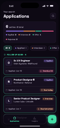
Every application and its status visible in a single scroll, with follow-ups due soon pushed to the top.
Frictionless capture
Logging a new application is fast enough to do the moment you hit 'submit' on a job board.
Missed follow-ups
Reminders surface the next action so quiet applications get chased instead of forgotten.
The search outgrows your memory
Modern job hunting means applying broadly — often 5–10 roles a week across LinkedIn, company sites, referrals and job boards. Each application is a small bundle of context: which résumé you sent, who referred you, what stage you're at, when to follow up. That context lives nowhere. Companies frequently go silent, so there's no inbox trail to lean on either.
"I've done so many applications I've forgotten most of them — companies don't usually respond, so I lose track of what I even applied for."
— My own notes, three weeks into the search (the seed for this project)
Spreadsheets are the common workaround, but they're clumsy on a phone, easy to abandon, and do nothing to remind you. The result is a search that feels like noise: no sense of progress, no prompt to act, and the quiet anxiety that something important is falling through the cracks.
What I learned living it
This project started from lived experience, backed by informal conversations with other job-seekers and a look at how people currently cope. Four patterns came up again and again.
1 · Volume kills memory
Past ~10 applications, people can't recall where they applied or what stage each is at. The mental model collapses.
2 · Silence is the norm
Most applications get no reply. Without a system, 'no response' is indistinguishable from 'forgot to follow up.'
3 · Follow-ups are where wins hide
The few replies often come after a nudge — yet follow-ups are exactly what slips when you're tracking nothing.
4 · The search is emotionally heavy
Rejection and silence wear people down. Tools that feel cold or cluttered make a hard time harder.
Who it's for
"I just want to know what I've applied to and what I should do next — without it becoming another full-time job."
- Apply to many roles without losing the thread
- Know when to follow up — and actually do it
- Feel a sense of progress, not just rejection
- Spreadsheets she stops updating after a week
- Forgetting which résumé went where
- No reminders, so quiet leads die
What "good" looks like
As a concept, there are no live usage numbers yet — so these are the design goals and the hypotheses I'd validate if it shipped.
Capture under 20 seconds
Hypothesis: if logging is faster than opening a spreadsheet, people keep the tracker current. Measured by median time-to-log.
Status in one glance
Hypothesis: a colour-coded pipeline lets users answer 'where does everything stand?' in <5 seconds. Measured by task success in testing.
Follow-ups completed
Hypothesis: surfacing due reminders increases the share of applications that get a follow-up. Measured by % of reminders actioned.
Sustained use
Hypothesis: a calm, rewarding dashboard keeps people returning through a multi-week search. Measured by weekly retention.
Structure before style
I started in low fidelity to settle the information architecture: a status-aware list as home, a fast capture form, and a detail view built around the one thing that matters next.
A calm, focused system
Dark by default to reduce strain during long sessions, with a deep plum base ("Eclipse") for depth and a single bright accent reserved for action and progress. Two typefaces: Space Grotesk for confident display, Manrope for readable UI.
Core components
Status colour is the system's backbone — the same four hues read identically on badges, the pipeline bar, the stepper and the charts, so colour alone communicates state everywhere.
The product, annotated
Five screens carry the whole experience: see everything, add fast, drill in, act, and reflect.
Applications
- Pipeline summary — a stacked bar + counts answer 'where do things stand?' instantly.
- Follow up soon — applications with a due reminder are lifted to the top, outlined in accent.
- Status filters count each stage, so triage is one tap.
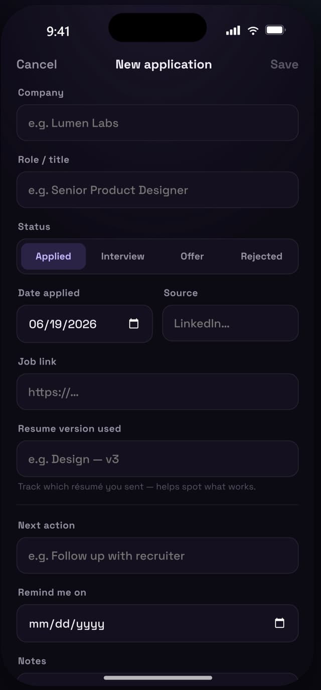
Add application
- Today pre-filled and a segmented status control keep the form to seconds, not minutes.
- Résumé version is a first-class field — closing the 'what did I send?' gap.
- Next action + reminder are captured at creation, so follow-ups exist from day one.
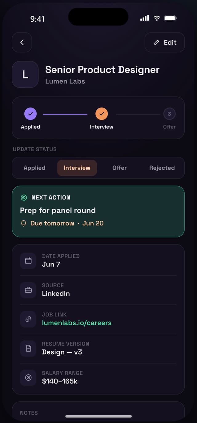
Application detail
- Status stepper turns an abstract state into visible progress.
- Update status inline — a one-tap segmented control, no edit screen needed.
- Next action card in accent makes the single most important thing impossible to miss.
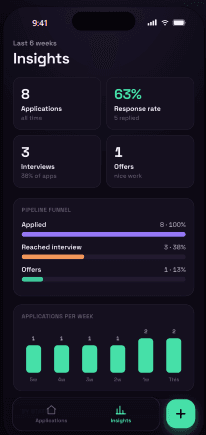
Insights
- Response & interview rates reframe silence as data, not failure.
- Pipeline funnel shows where applications stall.
- Applications per week makes effort visible — momentum you can feel.
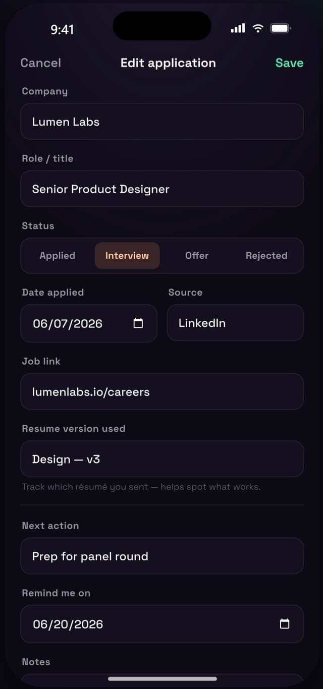
Edit
- Same mental model as Add — nothing new to learn.
- Every field editable, with delete kept safely at the bottom.
- Save stays in accent as the clear primary action.
Three directions, one decision
I built the prototype in three full visual directions and put them side by side — for myself and a few fellow job-seekers — to feel which one I'd actually open every day.
Near-black + electric blue. Sharp, but read as 'corporate productivity.'
Deep plum base — calm and distinctive without feeling cold.
✓ ChosenGraphite + mint. Clean, but closer to a generic dark theme.
Eclipse won on feel
The plum base felt human and focused where pure black felt clinical — the right tone for a stressful task people return to daily.
Accent tuned violet → mint
Violet looked great but blurred into the background. Shifting the action accent to mint gave buttons, reminders and progress a clear, optimistic 'go' signal.
Follow-ups got promoted
Early on, reminders lived only inside detail. Testing showed they were the whole point — so a 'Follow up soon' group was pulled up to the top of Home.
Where it landed
As a self-initiated concept, the outcome is a validated, end-to-end prototype rather than shipped metrics — and a clear set of bets to test next.
Screens, fully prototyped
An interactive iOS prototype covering the complete capture → track → act → reflect loop.
Directions explored
Converged from three complete visual systems to one resolved, intentional design language.
Of the core loop covered
No dead ends — every primary task has a designed, navigable path.
Qualitatively, the people I showed it to immediately understood the pipeline and singled out the "Follow up soon" group and the Insights view as the parts that would change their behaviour — exactly the bets the design was built around.
What I'd do next
Validate the 20-second bet
Run timed capture tasks with real job-seekers to confirm logging is fast enough to become a habit.
Auto-capture from sources
Explore a share-sheet / email parse so applications log themselves — removing even the 20 seconds.
Smarter reminders
Suggest follow-up timing based on stage and typical response windows, not just manual dates.
Gentle encouragement
Lean further into the emotional goal — celebrate momentum and reframe rejection, without being saccharine.
The biggest lesson: in an emotionally heavy product, tone is a feature. The follow-up nudge and the "you applied to 6 this week" stat do as much work as any layout decision.