UK Navigator
Simplifying Access to UK Visa Sponsor Information
My Role
UX Designer & Product Thinker
Duration
September – October 2024
Tools
Figma, FigJam, Notion
Focus
UX Research, Interaction Design, UI Design
Overview
UK Navigator is a platform that helps people quickly find companies in the United Kingdom licensed to sponsor work visas. It transforms a large, raw government spreadsheet into a clean, searchable, and user-friendly directory, making immigration research faster and more transparent.
This project demonstrates my ability to take complex, data-dense information and redesign it into an accessible, user-centered experience that empowers people to make informed career and relocation decisions.
🧩 The Problem
The UK Government provides a public list of licensed visa sponsors, but the data is distributed as a massive, unformatted spreadsheet. For most users — especially job seekers and international graduates — this format is intimidating and hard to navigate.
Key Pain Points:
- •Difficult to search for specific companies or cities
- •No easy way to filter by sponsorship route or rating
- •Poor readability and accessibility
- •Unclear when data was last updated, affecting trust
Users needed a simpler, more reliable way to explore this information — one that could help them quickly make informed career or relocation decisions.
🧠 Understanding the Users
To better understand the problem, I explored online communities where people discuss UK visa sponsorships (LinkedIn, Reddit, and immigration forums).
Target Users
- •International job seekers exploring companies that can sponsor visas
- •Students transitioning from study visas to work visas
- •Recruiters verifying a company's sponsorship status
Insights
- •Most users are not technical and find raw data formats overwhelming.
- •They want location-based filters and clear sponsor categories.
- •Transparency and update frequency directly influence trust in the platform.
🎯 Design Goals
From these insights, I defined clear objectives for the redesign:
- 1.Create a simple search and filtering experience.
- 2.Display key information at a glance (name, city, visa route, rating).
- 3.Ensure transparency with visible data sources and update info.
- 4.Make the interface clean, fast, and mobile-friendly.
🗺️ User Flow
A primary user scenario:
"As a job seeker, I want to find companies in Manchester that sponsor Skilled Worker visas."
Flow:
Home → Search bar → Filter by city (Manchester) and route (Skilled Worker) → Browse results → View company details
This guided my layout decisions — ensuring users could start with a search and refine quickly.
✏️ Wireframes & Ideation
I began with low-fidelity wireframes to simplify the flow and focus on usability. Key ideas included:
- •A prominent search bar on the homepage
- •Filter chips for city, visa route, and rating
- •A clear results layout with structured company cards
I tested multiple layout variations and kept the interface data-focused yet visually light to maintain clarity.
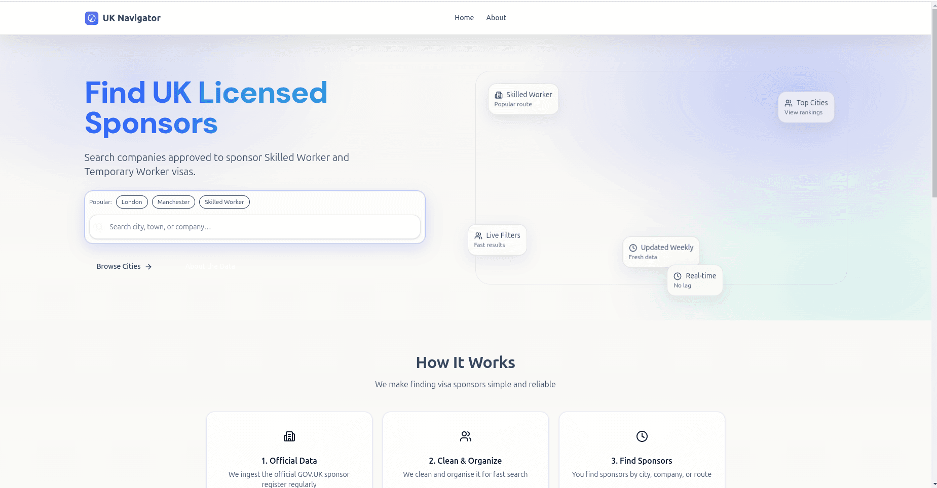
🎨 Final Design
The final design focuses on clarity, accessibility, and trust.
Key Features
- Search by company name, city/town, visa route, and rating
- Easy-to-scan company cards with structured details
- "Last updated" timestamp to show data transparency
- Dedicated transparency section explaining data source and license
- Responsive design for mobile users
Visual Direction
I used a calm, trustworthy color palette (navy, white, and subtle blue tones) and a clean sans-serif typeface for maximum readability. Components are spaced generously to reduce cognitive load and guide the eye effortlessly.
🧩 Usability Testing & Feedback
After sharing the prototype with a few early users (students and professionals):
- •Most found the filters intuitive and easy to use.
- •Users appreciated the transparency snapshot (sponsors count, lookups, update frequency).
- •One common request was to make search results more visual, which inspired the addition of city-based highlights and a top cities section.
📈 Results & Impact
The redesigned experience made it significantly easier for users to:
- •Find relevant sponsor companies within seconds
- •Understand data credibility through clear transparency indicators
- •Explore new cities and visa categories with minimal friction
Transparency Snapshot (Post-Launch Concept):
137K
Sponsors
1.5M+
Lookups
Weekly
Data Updates
💭 Reflection
Working on UK Navigator taught me how crucial information design is when dealing with complex, data-driven systems.
I learned to:
- •Balance simplicity and depth in presenting large datasets
- •Apply UX writing and layout to improve trust and comprehension
- •Think through how design decisions affect user confidence and task success
Next Steps:
- •Add personalized features (saved searches, recent views)
- •Integrate data visualization to show sponsor growth trends
🧰 Tools & Skills
✨ Takeaways
Simplified a complex dataset into a clean, searchable experience
Improved user trust through transparency and clarity
Demonstrated full UX process — from research to wireframes to final UI
Want to see more?
Check out my other case studies or browse all projects